
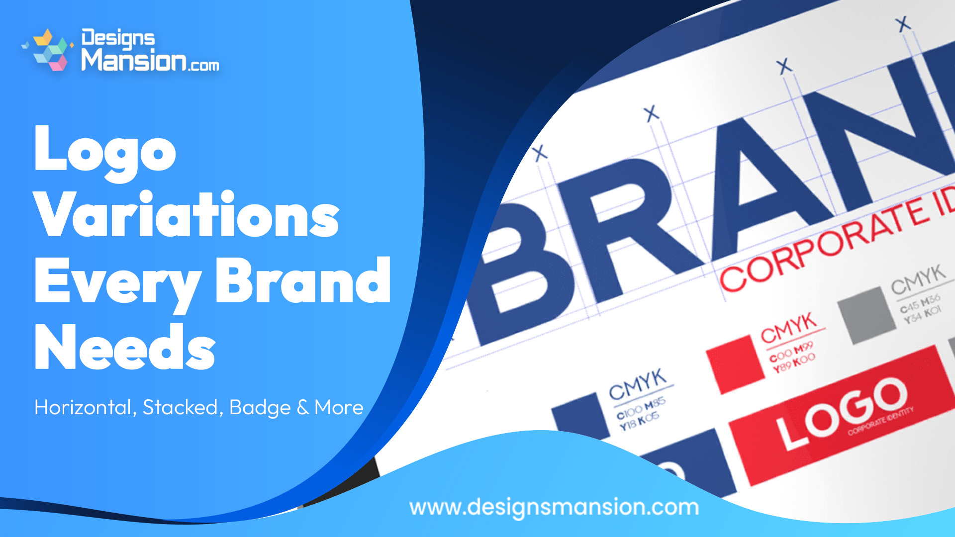
Did you know that a logo can lose its impact simply because it doesn’t fit the space it’s placed in? Many brands face this issue without realizing it. A logo that looks great on a website header may feel awkward on social media, packaging, or email signatures. This is where most branding efforts fall short, not in creativity, but in flexibility. A single logo version is no longer enough. The present blog tells the whole story: why logo variations matter, which types every brand should have and how they support consistency without limiting usage.
Modern brands live across multiple platforms, formats, and screen sizes. From mobile apps to printed materials, every placement comes with different layout needs. Relying on just one logo version can lead to scaling issues, poor readability, or forced design compromises. Logo variations solve this problem by allowing your brand to adapt while staying recognizable. When done right, they become an essential part of your brand assets and ensure your identity remains clear and professional everywhere it appears.
The horizontal logo is often the main version of a brand’s identity. It typically places the symbol and wordmark side by side making it ideal for website headers, presentations, and email signatures. This format works best in wide spaces and helps maintain balance without crowding. From a design system perspective, the horizontal logo often acts as the default reference for spacing, alignment and color usage.
A stacked logo places elements vertically, usually with the symbol above the text. This variation is essential for square or narrow layouts such as social media profiles, posters, and mobile screens. Stacked logos help preserve clarity when horizontal space is limited. Including this variation in your logo variations set ensures your brand remains legible and visually consistent even in compact formats.
Badge logos combine text and symbols into a unified shape, often circular or shield-based. They are especially useful for stamps, merchandise, app icons and packaging seals. This variation adds personality while keeping things contained. As part of your brand assets, badge logos offer a practical option for situations where simplicity and compactness are required without losing brand identity.
An icon-only logo strips the brand down to its most recognizable symbol. This version is commonly used for favicons, mobile apps and social media avatars. While it may seem minimal, it requires strong brand recognition to work effectively. Within a design system, the icon-only logo is carefully defined to ensure it’s never used in situations where clarity could be compromised.
Color doesn’t always cooperate. Dark backgrounds, black-and-white printing, or special materials can limit color use. This is why monochrome and reversed logo versions are critical.
These logo variations protect visual consistency when color is unavailable or impractical. They also reinforce professionalism showing that the brand has planned for real-world usage, not just ideal scenarios.
Consistency doesn’t mean repetition; it means control. When all logo variations are defined within a clear design system, teams know exactly which version to use and when. This prevents distortion, misuse, and inconsistent presentation. Well-structured brand assets empower marketers, designers and partners to represent the brand accurately without constant supervision. Over time, this builds trust and recognition across every customer touchpoint.
Logo variations are not optional add-ons; they are functional tools that protect your brand’s identity across platforms and formats. Horizontal, stacked, badge and icon versions each serve a clear purpose when guided by a thoughtful design system. If your brand relies on a single logo file, it may already be limiting its potential. At Design Mansion, we help brands create adaptable logo systems that stay consistent, practical, and ready for real-world use.


