Providing you the perfect solution for your business needs. Let's work together and unlock doors to success.

In the captivating world of branding, where visual identities wield incredible power, the role of a logo designer becomes paramount. Crafting a logo is akin to sculpting the face of a brand – an art that amalgamates creativity, strategy, and identity.
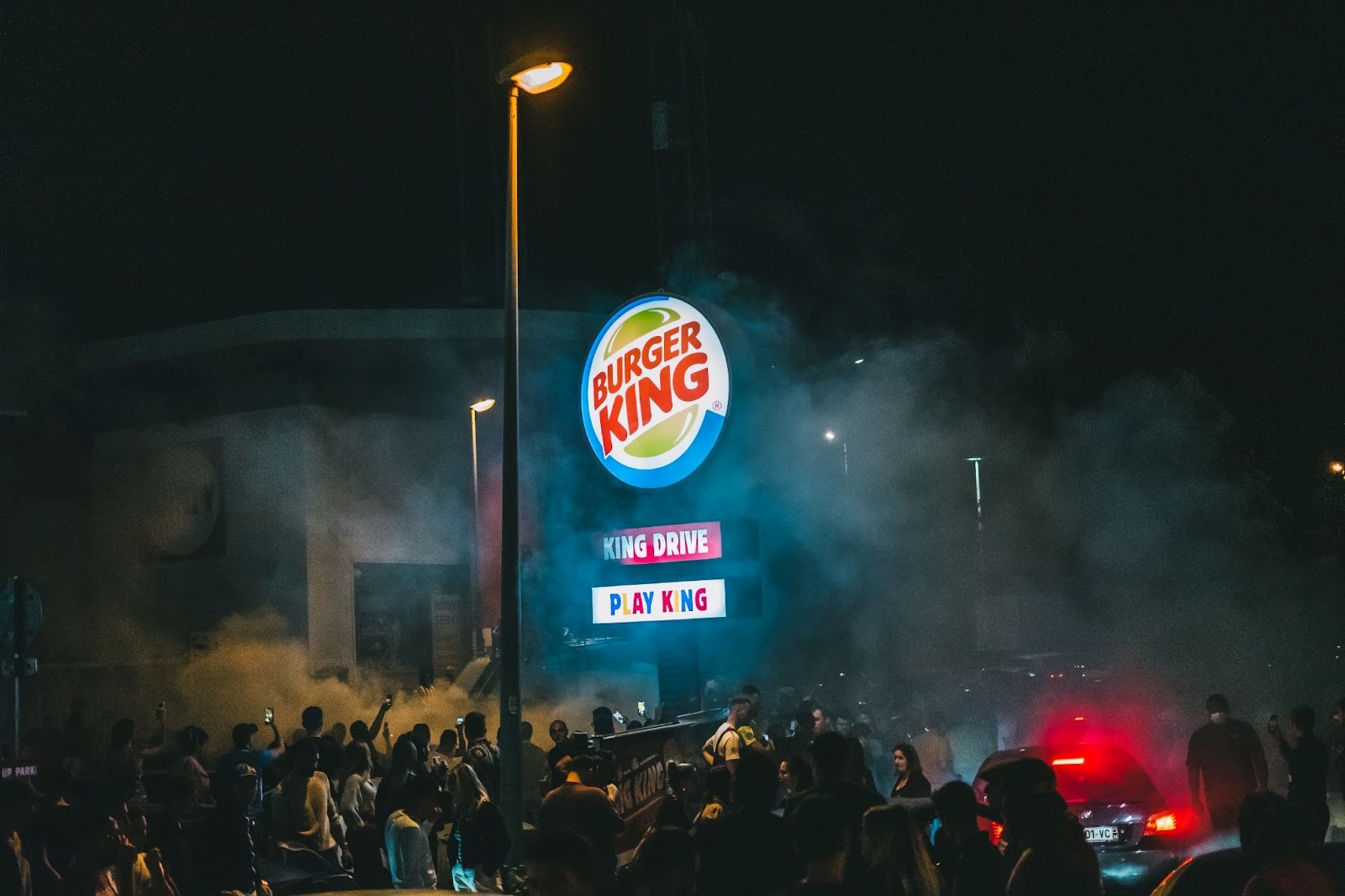
Consider, for a moment, the iconic Burger King logo. As we delve into the story behind its bold and flavorful logo, we'll peel back the layers of a brand's essence and uncover the artistry that goes beyond the surface. Join us on a journey that transcends the lines and colors, where each curve and stroke tells a story.
From creating a logo that resonates to understanding the very soul of a brand, welcome to the symphony of logo design where Burger King reigns supreme.
Burger King's logo journey is an exciting trek through time. From its inception, the logo has danced with change, shaping and reshaping its visual identity. Each alteration tells a story, whether it's the shift from retro charm to modern minimalism or the leap into digital design territory. Behind these evolutions lie branding strategies that mirror cultural shifts and consumer preferences, showing how Burger King adapts while staying true to its essence.
Unraveling the Burger King logo is like dissecting a visual masterpiece. The color palette's vibrant flame-grilling reds and royal blues ignite hunger and excitement. The bold typography evokes confidence and modernity, while the imagery – the bun-crowned bun – humorously marries regality and the brand's essence. Each element isn't just a design choice; it's a strategic stroke that paints a vivid brand story for all to savor.
Beyond its delicious appeal, the Burger King logo delves deeper into symbolism. That bun atop the letters isn't just a whimsical crown; it represents more than fast-food royalty. It's a nod to the brand's commitment to serving its customers with a royal experience. The colors and the typography echo the brand's values – boldness, warmth, and a hint of rebellious spirit. This isn't just a logo; it's an emblem that resonates with the heart and stomach of the audience.
The Burger King logo is a time traveler, adapting to cultural shifts like a shape-shifting chameleon. It has navigated through eras of pop culture, from vintage kitsch to sleek modernity, always staying relevant. This logo tells tales of changing norms, evolving tastes, and the ceaseless pursuit of staying hip. By molding itself to cultural contexts, it ensures that the King reigns supreme in every era.
In a world of fierce fast-food rivalries, logos battle for supremacy. The Burger King logo stands distinct amidst its competitors, not just because of its flamboyant colors and playful crown but for its commitment to a quirky and memorable narrative. While others chase classic motifs or minimalistic aesthetics, Burger King dares to be boldly unconventional, setting itself apart as the jester in a royal court.
Logo redesigns aren't just cosmetic makeovers; they're journeys fraught with challenges. For Burger King, it's a delicate balance between modernization and brand loyalty. Successfully merging familiarity with freshness is no small feat. When the bun crown took its form, it symbolized Burger King's determination to evolve while keeping the spirit alive. These redesigns aren't just about aesthetics; they're about communicating an ever-evolving identity.
Each logo alteration unveils a curtain call of reactions from fans and critics alike. The visual transformation is a theater of opinions, with some applauding the courage to evolve and others seeking nostalgia's embrace. Controversies swirl, but so does praise. The public's perception of the logo reflects more than just aesthetics; it mirrors a brand's journey, capturing the ever-shifting tastes of its audience.
Glimpsing ahead, the Burger King logo's evolution is a tantalizing mystery. With design trends shifting like tides, the logo could embrace a sleek fusion of minimalism and storytelling, capturing essence with simplicity. Digital landscapes may usher in interactive logos, adapting to users' whims, while sustainability could infuse eco-conscious hues. As Burger King navigates tomorrow, its logo will be a dynamic canvas, mirroring trends and values that shape the brand's identity, staying ever iconic and adaptive.
In the world of branding, the Burger King logo embodies the fusion of art and identity. A logo designer's craft harmonizes creativity and strategy, shaping the essence of a brand. As we unveil the Burger King logo's story, we uncover layers of meaning, evolution, and cultural resonance.
This logo isn't just an image; it's a royal experience. From challenges in design modernization to fan reactions, it captures brand evolution and audience tastes. Looking ahead, its evolution is a dynamic canvas reflecting simplicity, storytelling, and sustainability in the digital age.
As we savor history, symbolism, and innovation, remember that logo design's symphony is everlasting. To compose your own brand's melody, Designs Mansion awaits – where creativity and identity converge.
Create your brand's masterpiece with Designs Mansion, where art meets identity. Shape your logo's future with us today.